
Theme Challenge
Project: Leaf


Intro
Before I get started here outlining the process, know that its linearity betrays the experience and does not represent the chaos that is the process.
even while writing this, there is a tension between revealing my process authentically including my fears and anxieties and sanitizing it for you so I appear more competent.
Goals of the Project
This will be tough because my perception of what the goals were shifted through the project.
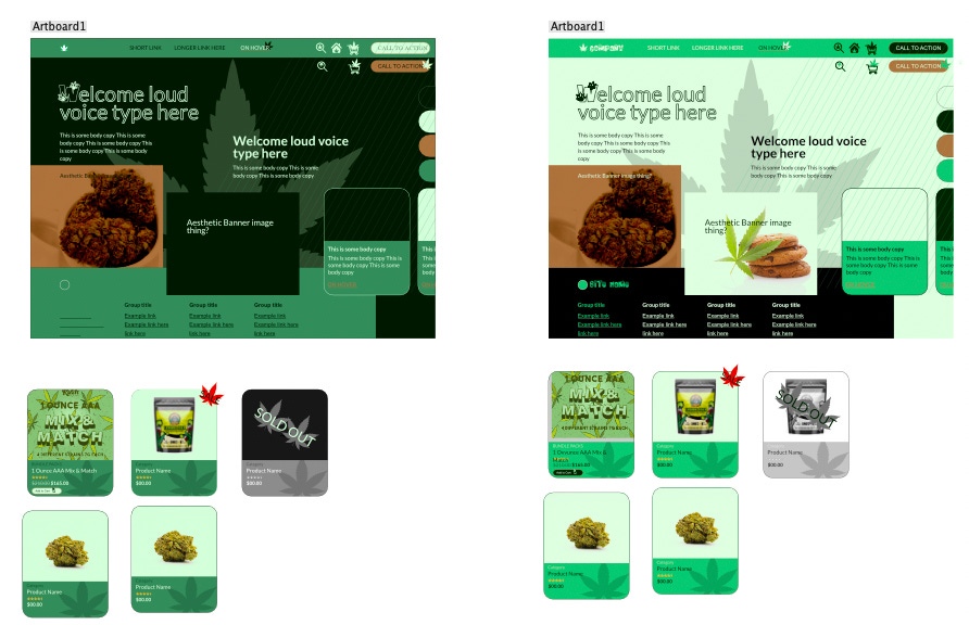
The way the project worked out was that we were given HTML/PHP to style. So it was a CSS/design challenge, ie, can you make a site look like it belonged in the space I was trying to emulate? In my case, it was to be a marijuana e-commerce website.
In addition to specifically focusing on the small details that sell the feel of professionalism and industry.
Initially, I assumed the idea was to create a design that looked like it belonged, but later after feedback, I realized that it was probably trying to copy and fit in as much as possible.
Mood Research

There were a bunch of websites I researched from the industry to create my mood board. I’m not entirely sure how useful this was since I never really stopped researching throughout the entire project.
The best this step gave me was the discovery of the Leaf SVG.

this majestic leaf was the thing that drove a lot of my upcoming choices.
Tiling the Styling
My style tile was cute but also naive and felt like it didn’t really do much. Style tiles also seem to look much better than the site itself.
This style tile was also processed similarly, we were given a template to style, and for a lot of it, I stuck to the template. my final Website ended up having none of the rounded corners like the style tile does.
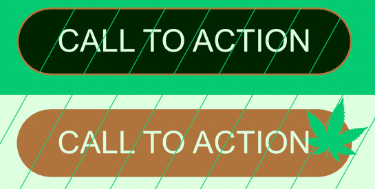
but there’s a lot of here that does stick around. these hover animations for the buttons are things I really enjoyed.
I also enjoyed making the icons for the cart and home. though I didn’t get the chance to use it in the final version.

The Coding
Initially, I felt I was doing great, and that it was too easy since I was just changing the fonts and colours.
that resulted in this.

I saw it trying to reflect my style tile. but it felt so less. so empty and devoid of life.
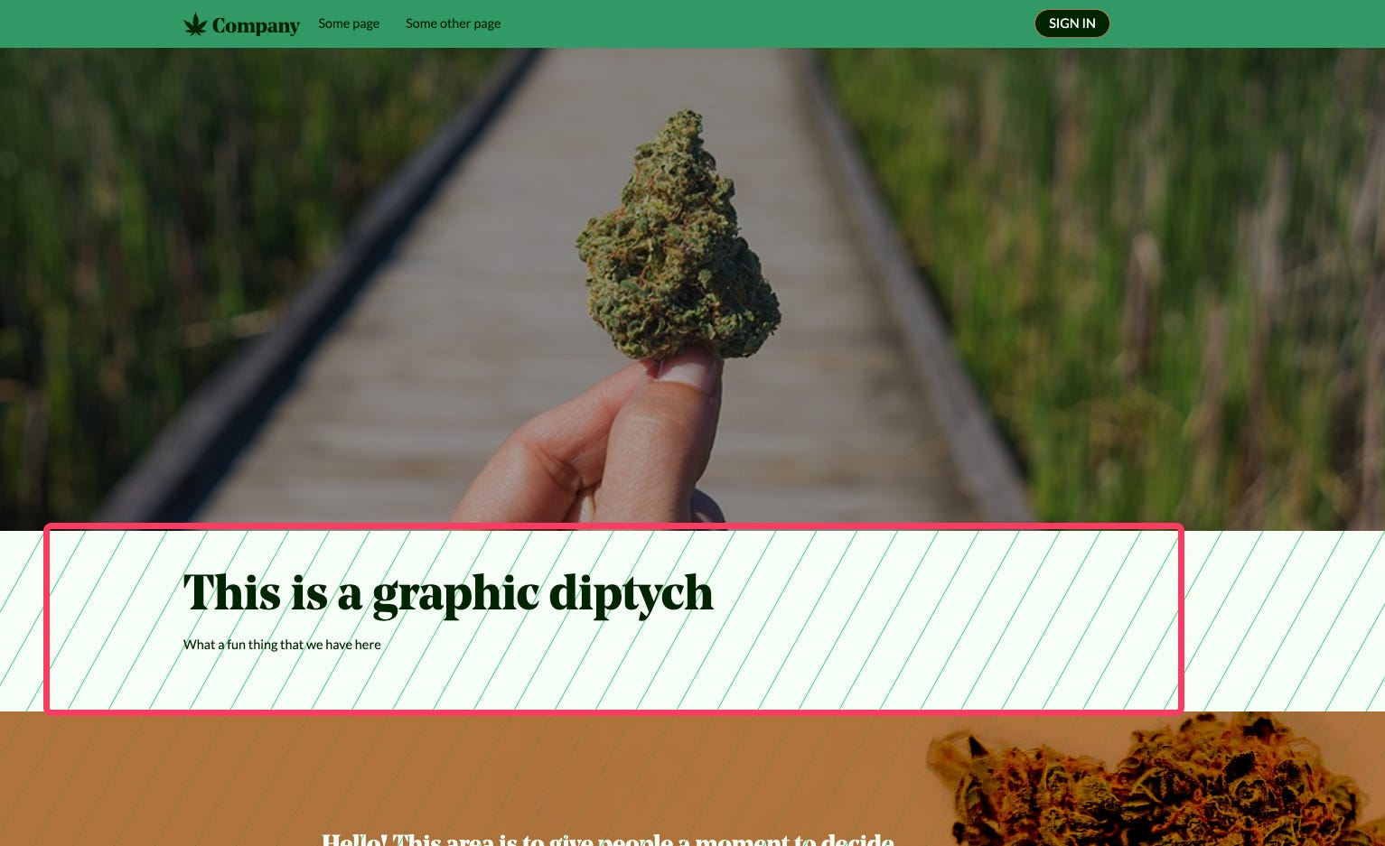
I felt like I was against a wall, and was only able to crack it after Derek told me to create a fake section using border-top. Smart guy.
that opened my mind to pushing what CSS can do, at least in the visuals more than functionality.
like this section in red, that only exists because of a margin-top from the brown section below. and the text getting there through positioning.
somewhere in the middle, I found another site to be inspired by, this was also around the time my idea of the project shifted to copying another site.
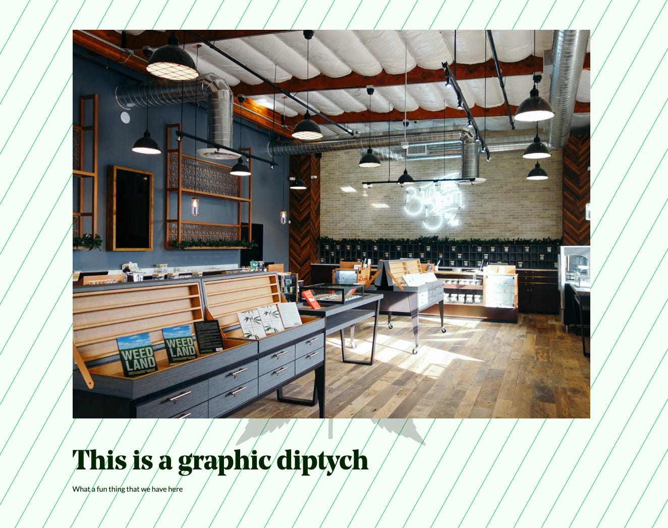
I tried recreating this landing banner from Your Local Cannabis.

but I couldn't do much without changing the HTML, even after the HTML restrictions were lifted couldn't do much with it because of the underlying structure of the site.
So I started hacking and forced a way to get what I want by applying the background image to the border.
Adolescence
My classmates started sharing their work, and I noticed that they were already breaking the bars and were figuring out creative ways to make their sites look good.
I was feeling inspired by their work and tried out different ideas and layouts.
The final day was coming up and I was almost done with version 4 but it still felt lacking, and even now doesn't feel done. now this one had been the hobbling together ideas from different sites in the space.
One of the things I enjoyed making was this hover animation

I was only able to even get here after Derek told me links didn’t need to look like buttons. Another moment of the bars bending. That plus the creative applications of pseudoelements.
I started to feel anxiety after seeing one of my classmates Andy, showed his site, and did it so well that I couldn't differentiate between the OG and his. and I thought I messed up. that I really was supposed to recreate another site especially after hearing feedback from Derek and Brian.
and that's where I branched off and made version 5 look as much like the main inspo site as I possibly could.
Finale
I ended up sticking with version 4 when the choice of what to post to Reddit was upon me. Mostly because if I'm looking for feedback and be on stuff I came up with right? but even here there's a tension between feedback on ideas I come up with vs feedback on my skills.

Awesome! I'd be interested to see a reverse engineered v4 or v5 style tile.